by Drew Stewart
In my journey through The Original Series as your Series Editor, I noticed something beginning with the Season 2 credits. For the last couple years I’d been noticing how a lot of “Star Trek” logos are lacking the curve of the E, seen here on the Remastered credits:
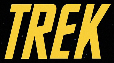
You can see the font used in the Season 1 credits that all of the E’s have this curve.

The first season also uses what looks like “Eurostile” or “Microgramma” for the episode titles and credits.
But then I started on Season 2, and noticed that this was no longer the case.

Notice how all of the added credits (Roddenberry & Kelley) don’t have the curve on the E. And now that created this new font, they began to use it for the episode titles and credits.
This continued into Season 3, this time with the credits tinted blue:

I asked Mike Okuda about this on Twitter, and he gave this response:
Curved E was in title graphic all 3 seasons. Opening cards 4 Shatner and Nimoy had it. Straight E used 4 all subsequent cards.
Those first three cards had hand-drawn lettering. Subsequent cards used hot-press type, with different art.
So the original credits were done by hand, but for some reason when they made a typeface from it, they did not curve the E. The Animated Series, however their credits were made, curved not only the E’s but the F’s as well!

Even today, the use of the curved E is inconsistent. Most fonts available online have the straight E, but most major uses of the “STAR TREK” logo make sure the E is curved.
The most frustrating thing is the 2009 movie:

You can see that the teaser poster and the first trailer that used the title have the italics and curved E. However the final trailer and the credits to the movie don’t use italics and have a straight E. But the DVD and Blu-ray covers go back to the italics and curved E.
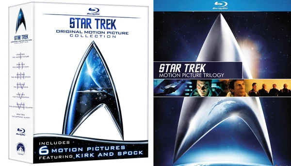
I’ve not seen any CBS/Paramount memos on using the TOS font, but the inconsistency is frustrating to me. The official Blu-ray sets for the Original Series movies have both italic options but only straight E’s!
It’s not a real problem, but personally, I’m going to try to keep the curved E alive. And now that I’ve pointed it out, you’ll start noticing it too.